We derive inspiration from our past, to improve our future. Our past works define us, we’re proud to showcase some of our best work.
Established in 2013, Camelia Rose is a perfumery inspired by French techniques and Arabic ingredients made purely in Saudi Arabia.
They utilize oud and a variety of fresh ingredients to create scents of all kinds ranging from strong, light, fresh, and long-lasting.
After six years in the kingdom, Camelia Rose wanted to adapt and expand their brand look to fit international standards.
They wanted to expand their brand visual from packaging, logos, and a complete revamp of the look and feel.
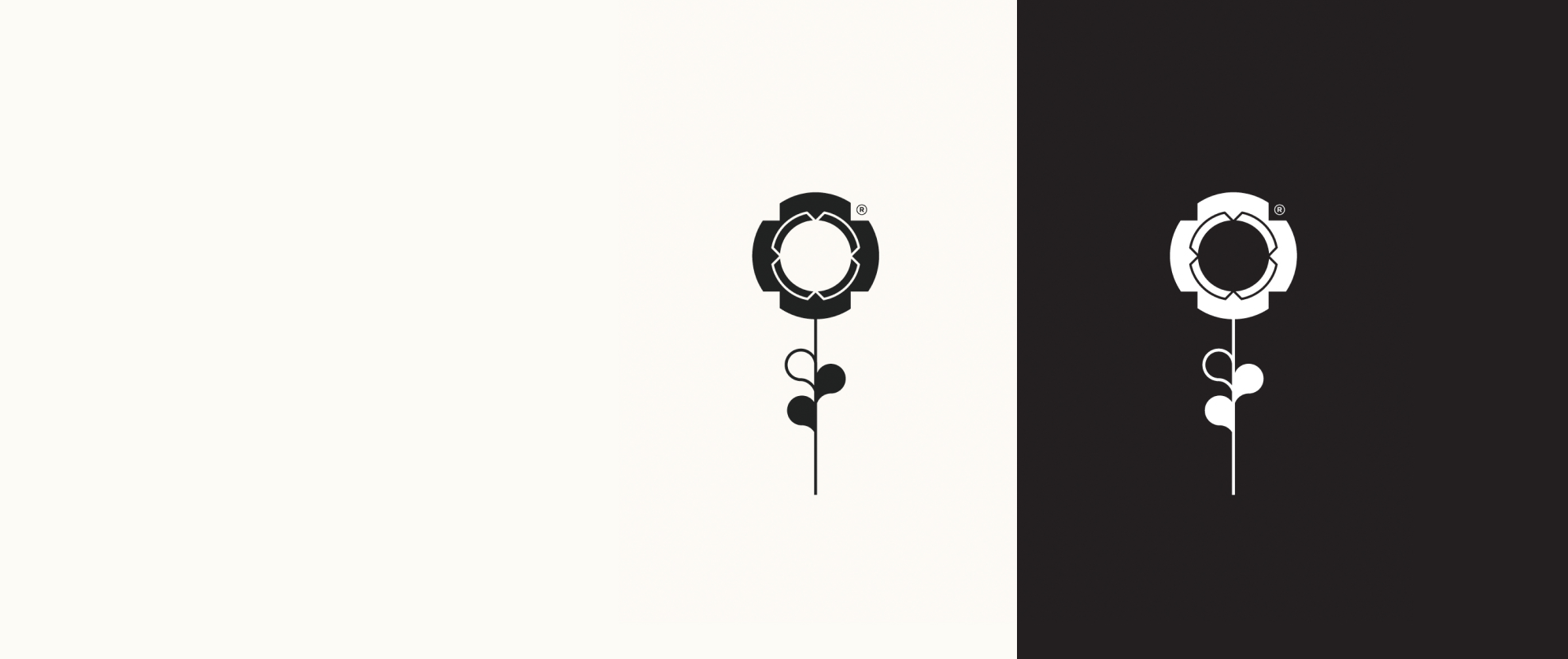
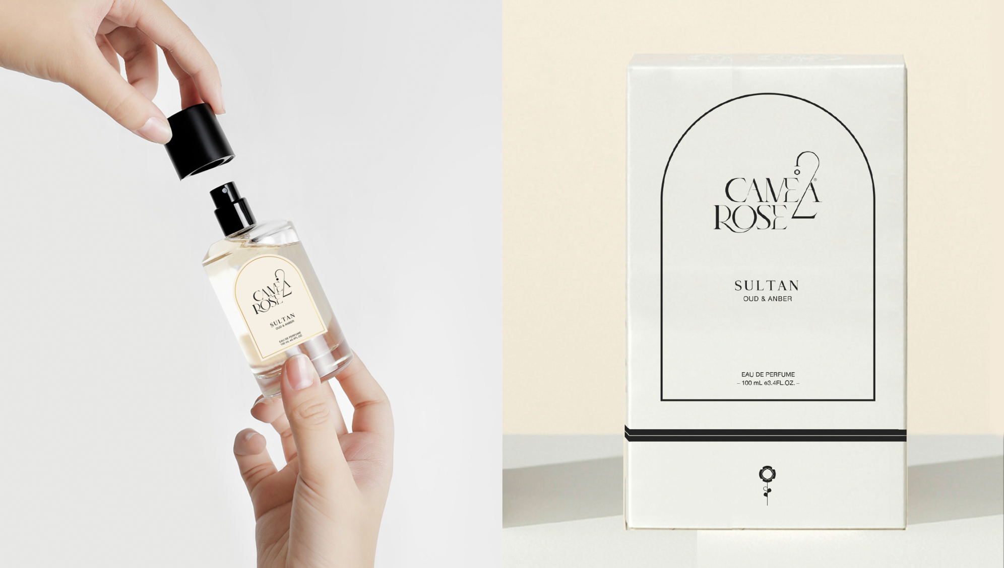
Their previous logo was heavily saturated with pink and had an outdated feel. We designed brand guidelines from the ground up for Camelia Rose and revamped their logo, we decided to stay close to the luxurious and high-quality essence a french inspired perfume would radiate.
The logo was designed to be minimalistic and elegant with a black and white color scheme and still contains the rose to symbolize their brand and be relevant.
We worked on generating a naming system for their perfumes as their naming system was outdated and confusing for customers.
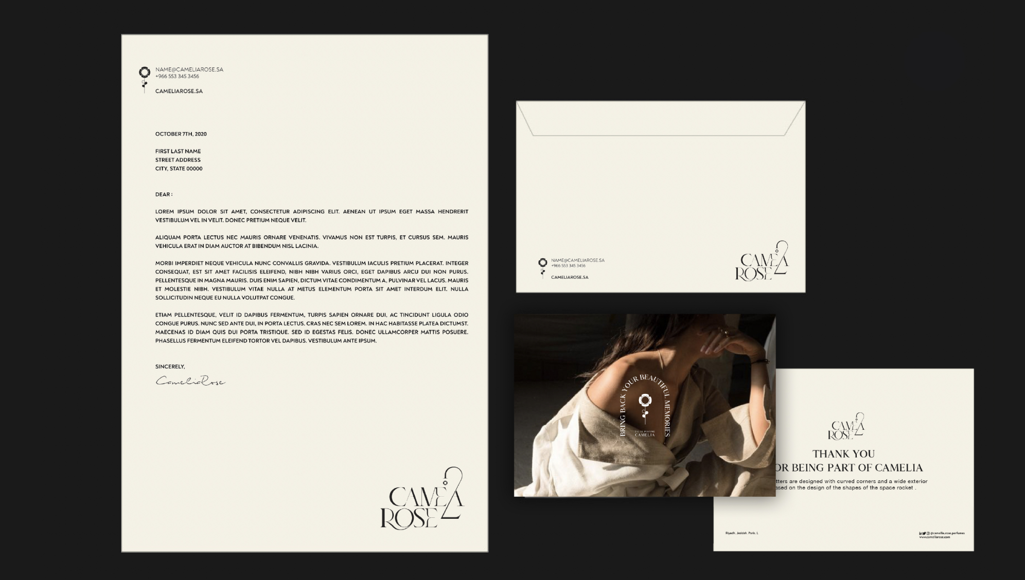
We then changed their old packages so the brand image could be consistent with their new guidelines, the boxes were made white with black outlines, and the elegant logo was neatly and clearly shown in the middle and paired with a new name generation system for their scents.
The old system just assigned numbers to the Camelia name; we gave their perfumes creative names that were descriptive of the exquisite scent and elegant at the same time.
The final result was a finer, more elegant, and luxurious Camelia Rose, with an image that can rival international brands in terms of quality, appearance, and style.